My blog was overdue for a change. It's been more than 3 years since I created the theme for this blog and I've grown to dislike some things about it. So I decided to use my extended weekend to redesign it. This post will act as a showcase of the changes I made and some thoughts on the design choices.
New Fonts!
I want to ask the the version of me from 3 years ago: Why the hell did you use a monospace font for the text?
I really don't know. I guess I spent so much time coding, that I wanted to have the same kind of look on my blog as well. However, when looking at old blog posts, I feel like it makes it much harder to read and follow. And no popular website or tech blogger uses them as a main font, so there's probably a reason for that.
But choosing good fonts is hard, especially when you want to match it with the design of your site. My current solution for this is browsing blogs of other people and checking what fonts they use.
New /talks page
The projects page was added at a later point, and I am still happy with what I came up with. When I decided to also add a talks page, I reused the same design and implementation, but it doesn't fit that well.
Talks have a description, date, location, slides and video link, which makes it quite different from the projects. Additionally, having two cards per row makes it look cramped and confusing (see left).
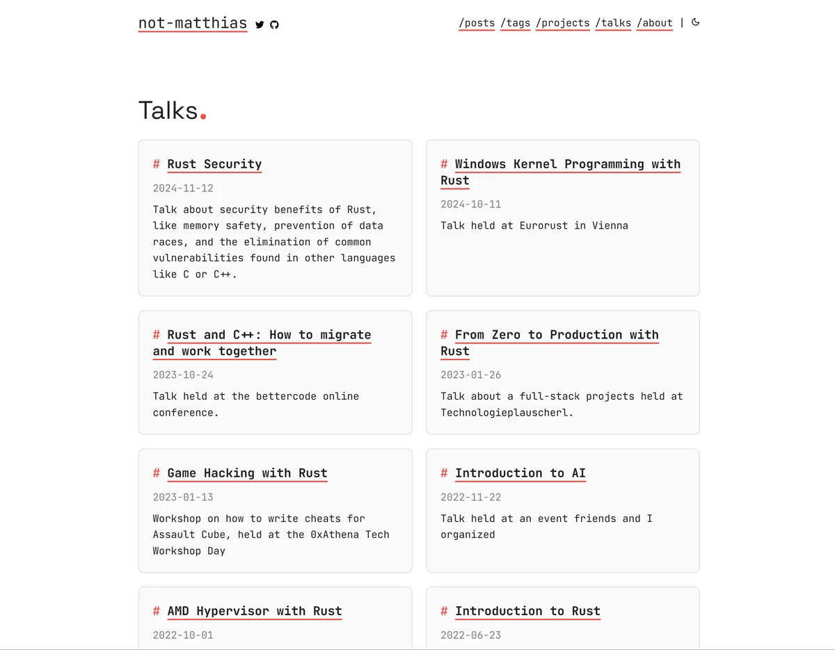
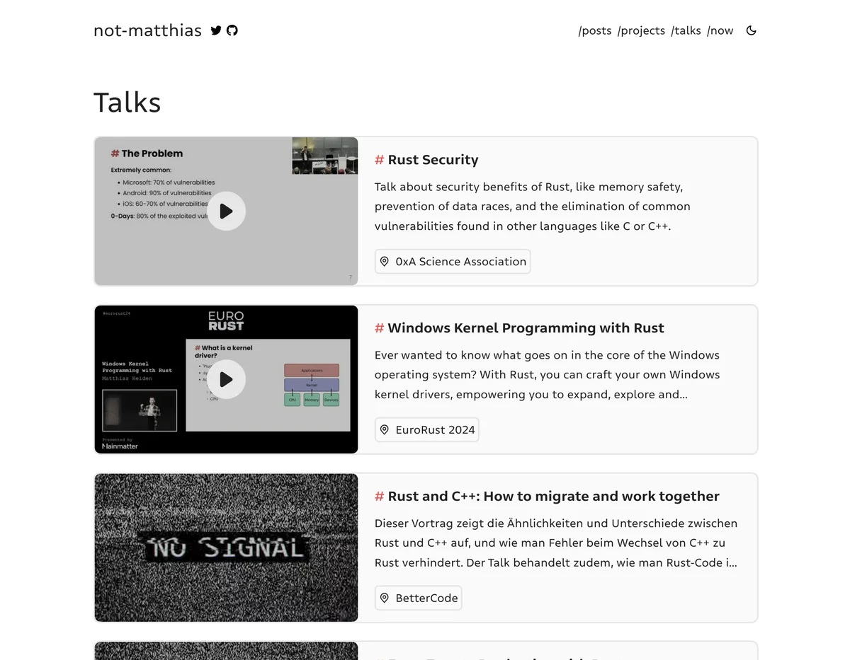
I like the new design much more, as it is more like a timeline and is more visually appealing due to the attached images. The new format also allows for displaying the metadata in a better way (see right).
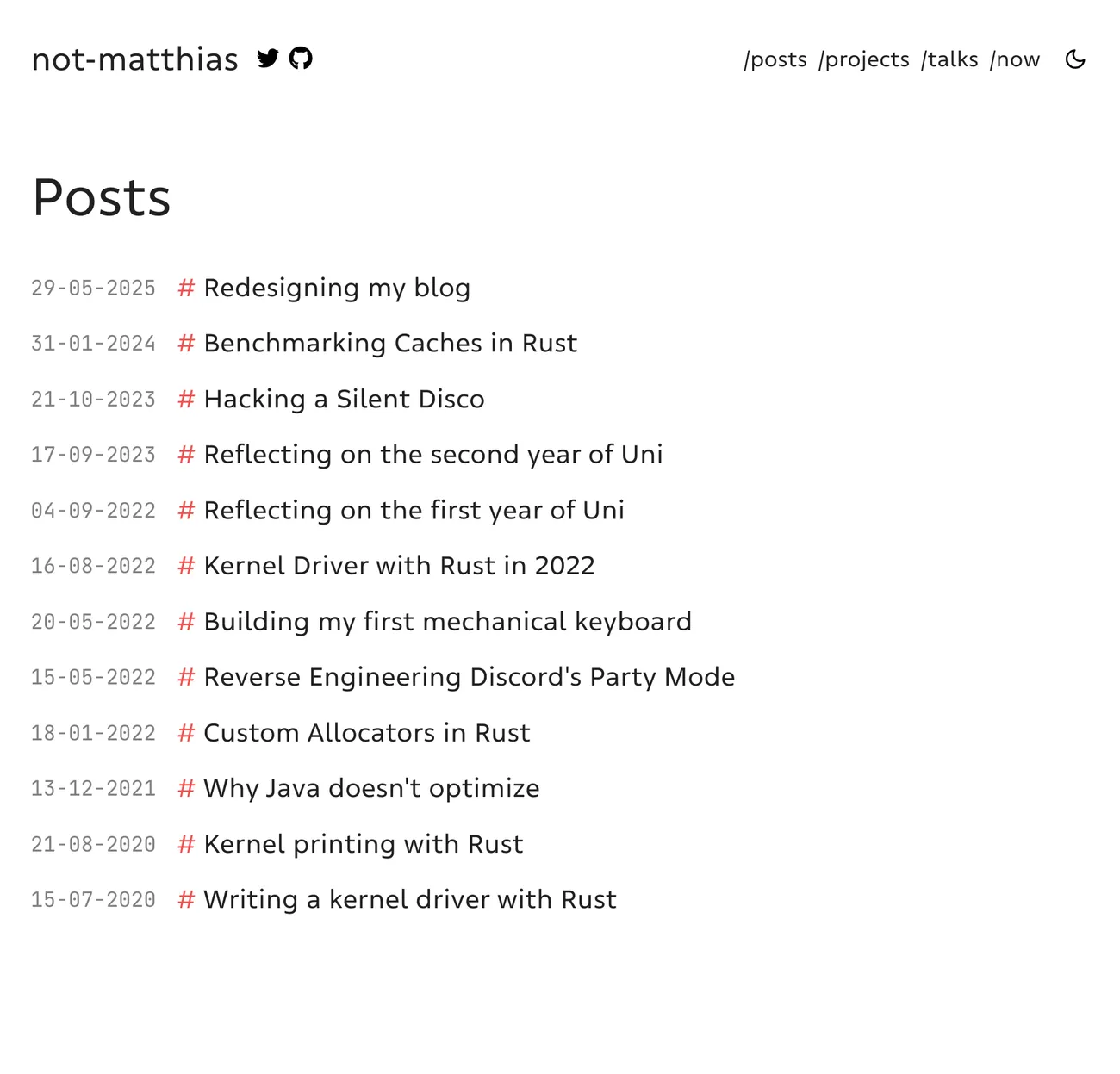
New front page
The front page is the entrypoint to a blog, so it should be the most polished and informative page. Many blogs just show the latest posts or a very short/minimal/lacking introduction, which is fine but I question the effectiveness. Even when only reading blog posts from aggregators like Lobsters or HackerNews, you will likely end up on the front page of blog posts you enjoyed reading.
The improved front page now contains the following:
- A small introduction of the author and the blog
- Most popular posts/projects/series
- Latest posts (at most 5)
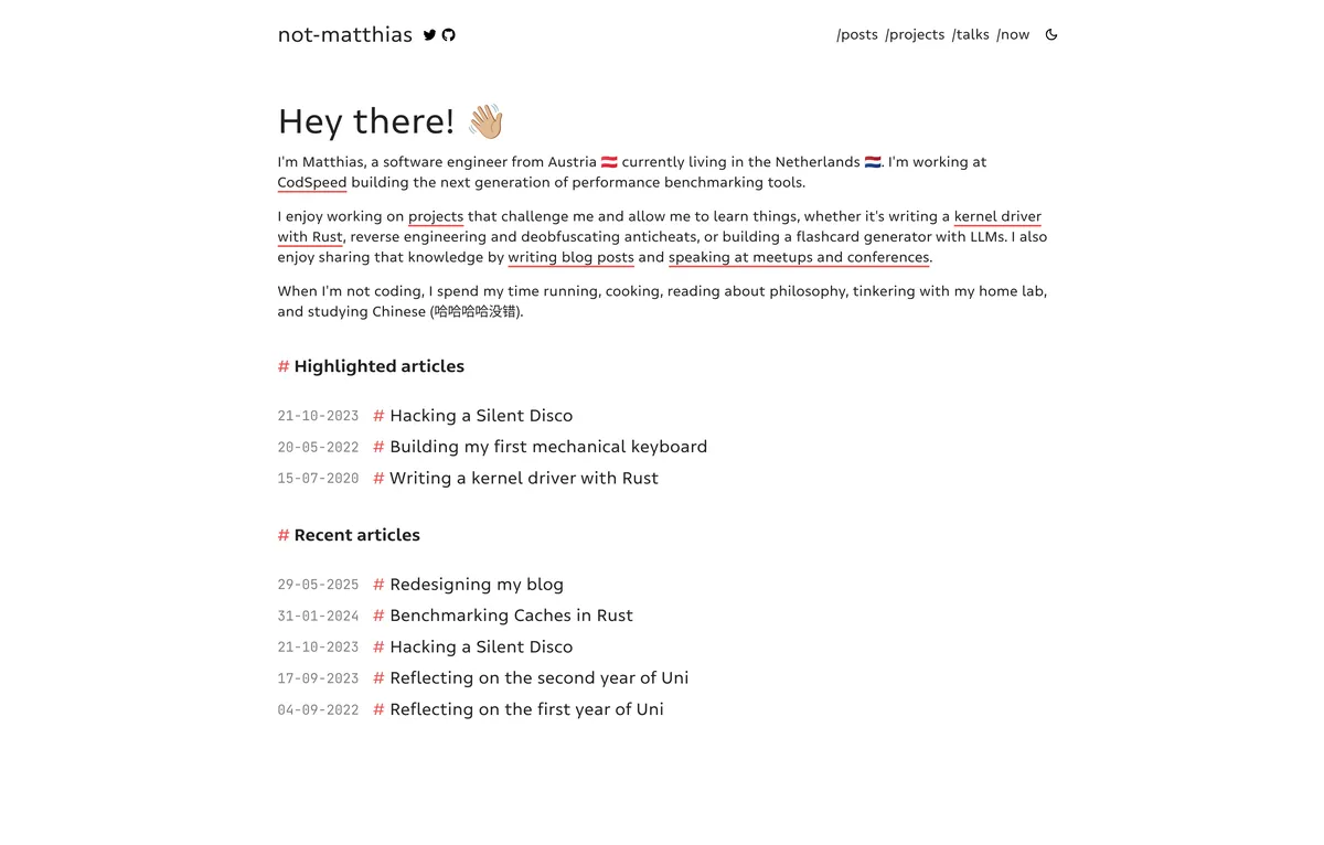
There's still a small issue where the highlighted and latest posts can contain duplicates but I feel like this is not a big issue.
Improved /posts page
The posts page is the place to find specific blog posts, so you should make it as easy and intuitive as possible to find interesting content. The old design was very minimalistic, but also quite hard to navigate.
Dates were printed with year first, which made it unintuitive to read since we are used to reading from left to right. I ended up with two possible formats, %b %d,%Y (May 29,2025) or %d-%m-%Y (29-05-2025) and chose the latter, as it is more readable and consistent with the rest of the site.
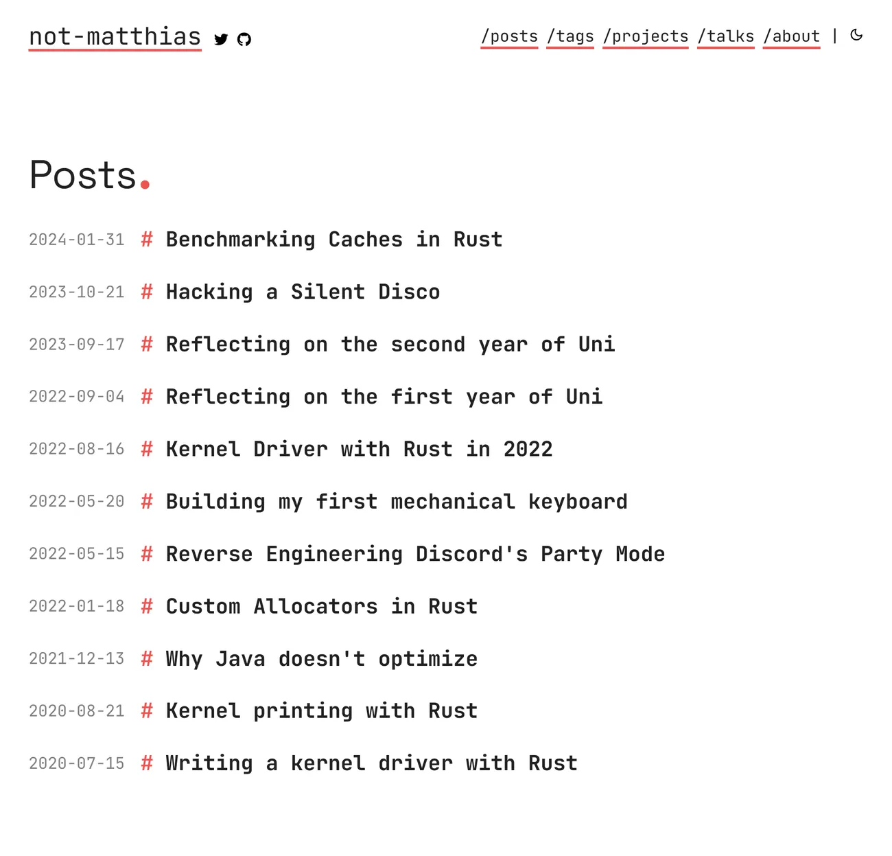
Additionally, descriptions or tags could be added to make the content of the post more clear. I do like the minimalistic look of it being a list, so I'll keep it like this for now.
Fewer accents
One of the things I didn't like was the overuse of accents. I'm already using them in headers and for links, which appears in many places. So when adding them in the header and other places as well, this will make it quite overwhelming on the first visit.
I thought about removing them entirely from links, but then they would be less visible and I'd have to think about a different way to visualize them. So I ended up removing the underline from the headers and only use it for links inside the text.
Maybe I end up changing my mind again, but for now I enjoy the simple and minimalistic look.
Other changes
I ended up changing many small things that annoyed me or should've been implemented ages ago:
- No more accent dots (Like. this.) at the end of headers: Looks nice, but doesn't add that much value. Sometimes interferes with the actual header.
- Removed borders on the images: They don't look that good, but I managed to recognize blogs using my theme this way :P
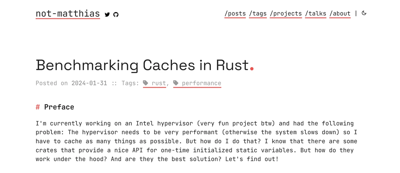
- Simplified the tags: Now they are displayed using just
#tagwithout any accents. This makes them (hopefully not too?) subtle. I didn't like the tag emoji that much, as it doesn't fit into the usage of#in the theme. - Smaller font sizes: The default font size was too big, so I reduced it and also made it adaptive to the screen size.
- Image optimizations: Added support for resizing and compressing the images to the
.avifformat to reduce the size of the website and load time.
Future work
I still have some features that I really want to add:
- Table of contents: There already exists an implementation in my theme but I think it's time for a rewrite and redesign. The current version displays it at the top, but I have seen a few websites that put them on the left and right border which I really like since this space is mostly empty anyways.
- Series support: I've always been interested in posting blog posts series about some large/complex projects. For now the best alternative is to use tags.
- Footer: Sometimes there's too little space at the bottom to comfortably read a blog post. It would also be nice to add more links in the footer. However, I haven't fully figured out the design yet so I'll leave this for a future rework.
What do you think about the redesign? Let me know of any issues or suggestions, I'm always looking to improve it. You can find the source code of this blog on GitHub.